Here we bring a collection of sources on different geodata. The way this tutorial is organized follows some of the bigger issues concerning the environmental coverage such as climate change, deforestation, water stress among many others
Introduction
Journalists and data visualizers cannot complain about the lack of sources on environmental issues. Because of years of scientific research and decades of earth observation, datasets are available in huge amounts and most often in open formats.
Here we bring a collection of sources on different geodata. The way this tutorial is organized follows some of the bigger issues concerning the environmental coverage such as climate change, deforestation, water stress among many others. We also indicate the tutorials you should follow if you would like to manipulate, map and visualize these data.
Daily active fire
Fire pixels or hot spots all over the world are monitored by NASA satellites. On the NASA´s Earth Data website you will find the link for the FIRMS project (Fire Information for Resource Management System). There you will find links for CSV, Shapefiles (SHP), KML (Google Earth format) and web services, covering the last 24hs, 48hs and 72 hours.
A good form to keep track of the forest fires in your area of interest is to sign up for email alerts

The website and the page where you can sign up for email alerts on forest fire
For larger datasets, covering several days months and even years of fire pixel, you can use the download tool also available at the website.
This is an example of what you can do with these datasets when you map the data. There is information both from fire pixel over the month of July in South America, but also a analysis of the biggest fire events since 2000.
Protected areas
Limits of National Parks, reserves and indigenous land are essential when creating a map or to contextualize your environmental story. The best source for it is the website Protected Planet, done by the World Commission on Protected Areas, a UN body.
There you can download CSV, SHP and KML with the boundaries of virtually every protected area in the planet. There is also information on the species existing on these areas and the status of their conservation, either if there are threatened or not of extinction.
This is the kind of map you can do by uploading a KML file on Google Maps for example
Data on the state of the Artic and the Antartic
Due to Climate Change, a lot of attention has been paid on the state of planets ice environment, or the criosphere.
The National Snow and Ice Data Center (NSIDC) provides spreadsheets, charts, KMLs and shapefiles that allows easy visualizations and data analysis of the extent of sea ice in the Artic or ice sheets in the Antartic.
The downloads are well explained on the Sea Ice Index Page
A good way of using this data is to create Google Earth Tours like the one that follows:
GHG emissions on country level
The United Nations Framework Convention On Climate Change (UNFCCC) receives official data from governments on emissions of Greenhouse Gases.
The data can be found their website on a section called GHG Data. There is data for specific pollutants, such as
CO2 – Carbon dioxide
CH4 – Methane
N2O – Nitrous oxide
PFCs – Perfluorocarbons
HFCs – Hydrofluorocarbons
SF6 – Sulphur hexafluoride
as well as for the indirect greenhouse gases such as SO2, NOx, CO and NMVOC.
The data is provided on XLXs with values divided by country signatories of the Convention. The format allows you to create simple charts for ranking the main emitters, like this.
Forestry and deforestation
Some of the best data compiled on forestry and forest resources can be found on United Nation´s Food and Agriculture Organization (FAO). Every five years they publish their “Global Forest Resource Assessment” and also they keep and update stats page (FAOSTAT) on trade and production of forest products, allowing the user to customize their tables for download.
On the example bellow is a simple thematic map done with Google Spreadsheet using the numbers of the 2010 global assessment. Here we are showing the countries colored by the size of forest land.
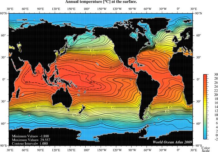
Oceans
The US National Ocean and Atmosphere Administration (NOAA) holds a rich database with information the salinity, oxygen saturation, phosphate concentration, among others indicators of sea health. One visiting the webpage of the Oceanographic Data Center (NODC) might get overwhelmed by the amount and complexity of information. The formats are not the usual spreadsheets, but there are some analysis ready to be used.
For example, if you access the figures database is possible to find useful information on oceans temperature, like the one below.