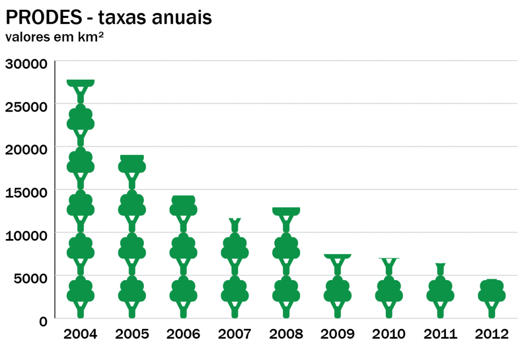
In this tutorial we will learn how to make a column chart using data in a table and how to customize it with some icons.
Introdução
Adobe Illustrator is a drawing tool that can also be used to construct simple static graphics. Although your options are limited (bar, line, area, scatterplot, pie and radar), the possibilities for customization of color, type and other visual elements make it a very popular software.
In this tutorial we will learn how to make a column chart using data in a table and how to customize it with some icons.
Starting a new document
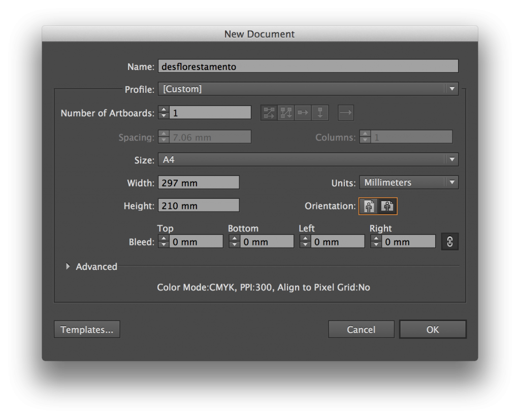
In the top menu, select File> New. Name the file and keep the default size (A4), only changing the page format to “landscape”.
Tools
If you have never used Illustrator before, do not be alarmed: there are few tools that we need.
The first tool is a column chart. Select it and then click to drag and define an area on the document, this will be the size of your graphic.
Adding data
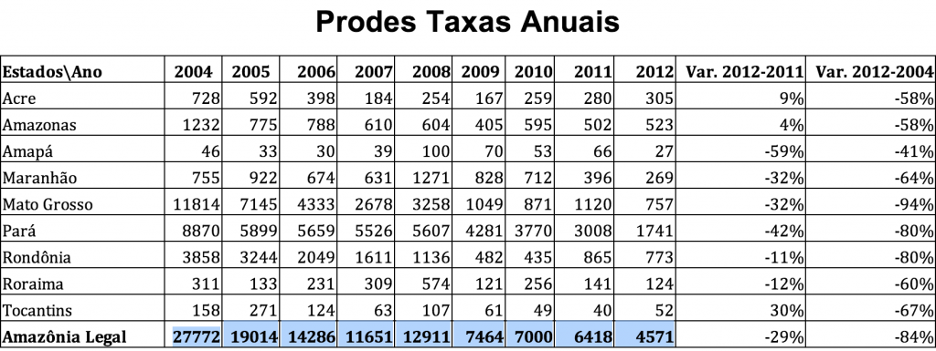
Once you define the area of your chart, a window with a blank table will be displayed. We will use the data of total deforestation in the Legal Amazon from 2004 to 2012, measured by PRODES. You can select the row with the corresponding numbers (totals only, without variation rates or numbers per state) and paste it into the Illustrator window.
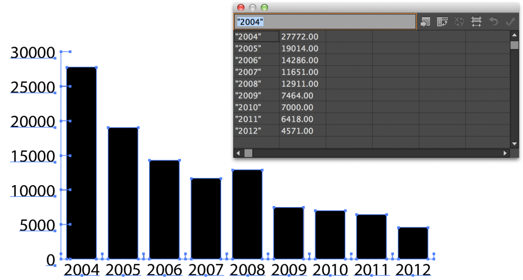
Paste the data in the second row. Let’s use the first line to enter the years.
To make it possible for the software to interpret the numbers of years as titles, and not values, they must have quotation marks.
Finally, invert the values of row and column selecting ‘transpose row/column’.
The column chart will be drawn when you click the ‘applybutton or by saving the changes and closing the window.
Formatting the diagram
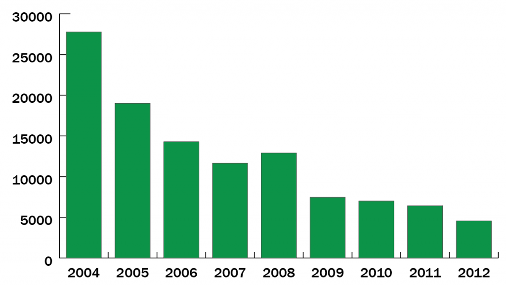
You can change captions and colors of your chart using the direct selection tool. Use the selection tool only if you want to move the entire diagram.
When you select an element, the top bar will show which features can be changed (color, font, font size, contour etc).
A warning at this point: do not ungroup the graph (Object > Ungroup).While this allows you to change elements more easily, you will lose the ability to edit the data and other formatting options.
Inserting Images
You can customize your diagram so that it displays images instead of columns. Any image drawn in Illustrator will work for this. In our case, we use an icon available for download at NounProject. This one is free to use, modify and reproduce. Some other drawings from the site may impose restrictions on use, from mandatory author citation to prohibition of commercial use, be aware when doing new research.
When you unzip the .zip of the site, you will find a file .svg. This is a vector file, therefore it is scalable, which is fairly common. Open it in Illustrator, click the tree with the selection tool and paste it in the file that contains the graph.
VYou can change the colors of the design in the same way we did previously with the columns. I will leave the tree green with no outline:
Now, select the tree and use the command Object > Graph > Design from the top menu.On the Design dialog box, select New design.
Applying images to the diagram
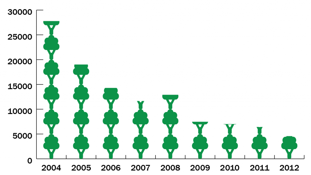
Click on the chart with the selection, tool, click again with the right mouse button and select Column. Select your diagram from the left list. There are four options to apply the icon to the columns: the first two will resize the drawing (distorted or not). In the last one, just a piece of the icon is resized, making it “stretch” to the height of the bar. Let’s use the 3rd option where the symbols are repeated according to the column value. In the second box, select the value that each icon will represent. Watching the numbers on our list, ranging from approximately 4,500 – 27,000, let’s use 5,000 as a unit. The last fractional value of the unit (5,000) will be represented by a cut or a scaled drawing. Let’s choose the first option.
Finish formatting
You can access other diagrams options – you can even change the entire graph to another shape, such as pie chart – clicking on it with the right button and selecting ‘Type’. In this case, let’s change a few details of the x and y axis to improve readability.
In the menu of values, change the scale marksso that they will be on the whole width of the graphic. Since we are not writing the values on the columns, these mark will help improve the readability.
In the category axis menu, remove the tick marks, since the columns are good enough to split the years.
At last, use a little lighter color for the horizontal marks, so they will interfere less with the drawing. And add the title with the text tool (it is a separate element of the chart):
Conclusion
Although the effort to do a graph in Illustrator may look great at first, the design and customization options make it worth it. This tutorial presents only an introduction to the graphics tool. If you are not confident enough to start everything from scratch, download the .ai file of this example and change what you think is needed. Try to explore other options by clicking with the right button on the chart. You can even go back to the original table to change the numbers to select the data — which is quite useful when you are not sure whether you will be working with the final information.

