In this tutorial we will learn how to load data from an external file and we will create a graph with a population area x for the 10 most populous cities in the world.
Introduction
Originally created as a tool to teach programming to visual artists, Processing language now has applications in several areas, including data visualization. Its simplified syntax is a good alternative for beginners to the coding world, and its development platform can be downloaded for free online.
In this tutorial we will learn how to load data from an external file and we will create a graph with a population area x for the 10 most populous cities in the world.
Processing Environment
When you open the program, you will find something like a text editor. That’s where we will type commands – no, there is not a “toolbar” here, since the original goal of Processing is to teach programming fundamentals.
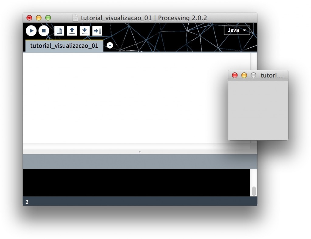
To run the script that we are going to write, just click on the play button at the left top corner of the window. A new window will open, empty for now, since we haven’t created any commands yet. Close it (or press the stop button) and save your file before you start programming – by default its name is the creation date, but you can choose any other name.

Basic Commands
To begin to understand Processing syntax, type the code below and run the program:
ellipse(600, 100, 100, 100);
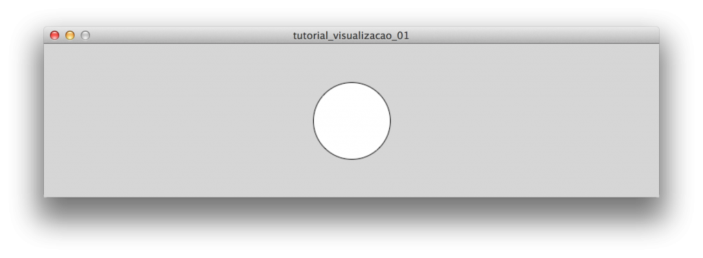
You will see a window like this:

What does this mean?
These commands are called functions. We use two of them: size and ellipse.The first defines the size of the document we are going to work with (in pixels). The second draws an ellipse. Beside each one, inside the parentheses, we have the parameters: information that the program needs to know for how it will perform each function. In our case:
ellipse (horizontal coordinate of the ellipse, vertical coordinate of the ellipse, width of the ellipse, height of the ellipse);
It means that it’s possible to translate the second line as “draw an ellipse 400 pixels from the left edge and 100 pixels from the top, 100 pixels high and 100 pixels wide”. Try to change these numbers to better understand how they work.
At last, some details we need to be aware of:
- parameters must always be separated by commas (white space makes no difference);
- we always need a ; after each command.
- It doesn’t matter if you have a space or a paragraph between these symbols, but they must be there!
If you’re curious and want to try other ways before going ahead, take a look at the following commands:
point()
rect()
triangle()
You will find instructions for each one on the Processing reference web site.
Visualizing: accuracy vs. synthesis
To see the density of each city here, we will use a straightforward technique: representing the total number of inhabitants as points within the city area. This feature offers a less precise notion than a bar chart would, for example – you can not tell the area or the population of the cities just by looking at the pictures below:

Our intention, however, is simply to present a direct visual and intuitive comparison of the theme: more points, more people; larger square, the larger area. In choosing one or another way of visualizing, always think about the balance between these two variables and analyze how they can work best according to the purpose of your chart.
Formatting data
We will use data from the 2013 Demographia World Urban Areas to draw a graph ranking the 10 most populated cities in the world (table 1).
A simple and practical data format that can be read in Processing is the tsv (tab-separated values). Basically, it is a text format that works like a table, with values separated by tabs instead of cells.

Transferring data from a PDF file into a table is not always an easy task, since the breaks hardly follow the format of the cells that we need.
In the image above, we will only need the columns Urban Area, Population Estimate e Land Area km2. You can download the formatted file here or try to create your own:
- Windows: Use Notepad and save the file as “cidades.tsv”.
- Mac: Use the Text Edit. Press command + shift + T to transform the file into unformatted text. When you save, select Unicode (UTF-8) in the encoding option.
Loading data
Drag the file to the Processing window and you will see the message One file added to the sketch. This just created a copy of cidades.tsv in the folder that Processing created for you. To read it in the script, add the following code and run:
Table tabela = loadTable(“cidades.tsv”, “header”);
for(int i = 0;
i < tabela.getRowCount();
i = i + 1){
TableRow linha = tabela.getRow(i);
rect(120*i, 50, linha.getInt(“área”), linha.getInt(“área”));
}
Viewing area
Ok, what is this code doing? Let’s understand line by line:
// Loading the file into a table. “header” means that the first line of the file should be understood as a header.
Table tabela = loadTable(“cidades.tsv”, “header”);
// Creates an action that will be repeated several times,…
// It draws a rectangle at position y 50 and x according to the formula “120 times counting”.
// It means that, in the sequence, coordinate x will be: 0, 120, 240, 360 … to 1080.
// As our count of 10 elements starts at 0, it goes up to 9! rect(120*i, 50, It defines width and height of each rectangle the value that is read in the “area” linha.getInt(“área”), linha.getInt(“área”)); }
In the resulting image, we can’t see the whole rectangles, because the numbers of the area we have for each city are very large:

A good solution to solve this is to change the command of the rectangle to:
sqrt(linha.getInt(“área”)), sqrt(linha.getInt(“área”)));
The sqrt function calculates the square root of a value. For us, it’s a quick and useful way to reduce the sizes:

Additionally, this patch makes the areasof rectangles proportional to the values that we are representing, not their height and width. This is necessary to avoid distortions when we use a figure like a circle or a rectangle. If we only had to divide the area value by 100, for example, we would have a disproportionate image:
linha.getInt(“área”)/100, linha.getInt(“área”)/100);

The picture above makes the cities look much different in area than they really are, a distortion caused by the confusion between linear dimension (height and width) and size(square area).
Simplifying the code
Before leaving for the second data point of our visualization, the population of each city, we will try to simplify some things to make our algorithm more intelligible:
for(int i = 0;
i < tabela.getRowCount();
i = i + 1){
TableRow linha = tabela.getRow(i); int posX = 120*i;
int posY = 50;
float lado = sqrt(linha.getInt(“área”));
rect(posX, posY, lado, lado);
}
If you run the code above, you will see that the visual result does not change at all. What we did was just write the same commands in a different way: instead of calculating everything inside the function rect(), we defined threevariables variables with values and then used them in the drawing of the rectangle:
posX
// Variable name, invented so I remember what it refers to
= 120*i;
// it assigns the value “120 times i” to my variable
float means that this variable can store a fractional number, since we do not know if the result of the formula “root area” will be a whole number.
Viewing the population
As mentioned earlier, the idea here is to represent the total number of inhabitants of each city as points within the areas that we have already designed. Below the line with the command rect(), add the following code:
j < linha.getInt(“população”);
j = j + 1){
point(posX,posY);
}
Be aware to write this command before the last key } that you already had in the document. Being inside this key, Processing will understand that this command must be repeated every time it is reading a table row – which is what we want, since we are going to draw the population for each city. The structure here is similar to the previous one:
for(int j = 0;
//… starts at zero…
j < linha.getInt(“população”);
//..it goes to the read number
//in the “population” column, of each line…
j = j + 1){ // …and it increases one by one…
//…draw a point.
point(posX,posY);
}
If you try to run this code, it is likely that your computer will take a long time – if not stall. This is because the number of repetitions that we are using is very large: 37,239,000 points only for the city of Tokyo! To solve this, change the second line of this section to:
With this, we draw 1 point for every 5,000 inhabitants (not 1 to 1).
We still need to correct one detail: if you study carefully the command point(), you’ll notice that all points of each city are designed in the same place, one above another: on the x and y coordinate that corresponds to the upper left corner of the square. Change this line to:
random(posY, posY + lado));
The command random() results in a random number, drawn from a minimum and a maximum value. In our case, the result is:
random number between (the y coordinate of the rectangle and the same coordinate + o lado);
Run the program and we will have our final result:

In the end, comparisons are obvious: Tokyo and New York are the cities with the largest area, but their population density is much lower than cities like Manila and Karachi.
If you want to save the file that you created as an image to use in another program, simply add one last line:
To save in another format such as tif or png, , simply change the file extension in the code above.
Conclusion
Programming for the first time can sound like an unfriendly task. However, as you start to understand the logic behind the commands, to deal with several languages is just a matter of learning different syntaxes, some are more similar than others. It is similar to speaking several languages.
Even though the work is hard in the beginning, you will see that the advantages are worth it: in the case of the file that we used, for example, you can simply change the .tsv data to generate a different version of the view, without having to make manual adjustments to the image. In addition, programming should be understood more as a language than as a tool: instead of pre-defined resources, you can build the graph how you want it to better fit your data. The possibilities are endless.
Take a look at this example file and try to change a few parameters to customize it: background color, size, space between areas etc. From there, explore the Processing reference page and try to redo this example using another type of visualization, such as bars or lines.


