Introduction
Agricultural burning and forest fire are some of the planet’s most serious environmental problems and, unfortunately, a very common occurrence in many countries. In the forests of the Amazon, the Congo Basin and Southeast Asia, fire can mean the advance of deforestation and most part of the fires are caused by humans in order to “clear the ground” for agricultural production or new pastures.
In this tutorial, we will demonstrate how you can create your own map of fire hotspots and update it in real time. This is made possible through the availability of data from satellites orbiting the Earth. These datasets are updated daily by NASA – the US space agency – and can be viewed with the help of two digital map-making tools – Google My Maps and Carto.
Finding FireData
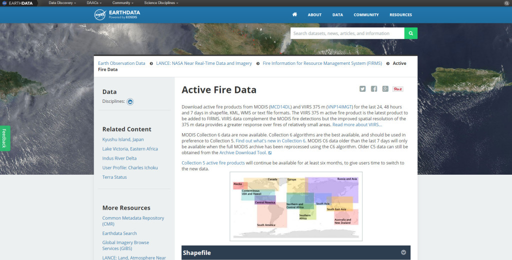
The site Earth Data from NASA is one of the most complete repositories of freely available satellite data. Through the NASA FIRMS project (Fire Information Resource Management System) you can access real-time data in multiple file formats and also order time series to download. In this tutorial, we’ll work with the CSV format, the table separated by commas.
This is the page of Active Fire Data on NASA’s Earth Data website
The first step after accessing the FIRMS page is to continue to Active Fire Data repository. There are two databases that can be used. One of them, the MODIS sensor, although lower resolution (1 km), has the longest historical series because the sensor has been operating for years in the Terra and Aqua satellites. More recently, the higher resolution (375 m) VIIRS sensor, has been generating large amounts of fire data. For this example, we will use the text file (CSV) of the MODIS sensor for the last 24 hours in Central Africa.
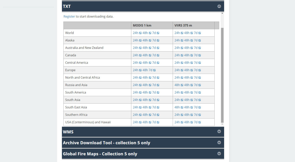
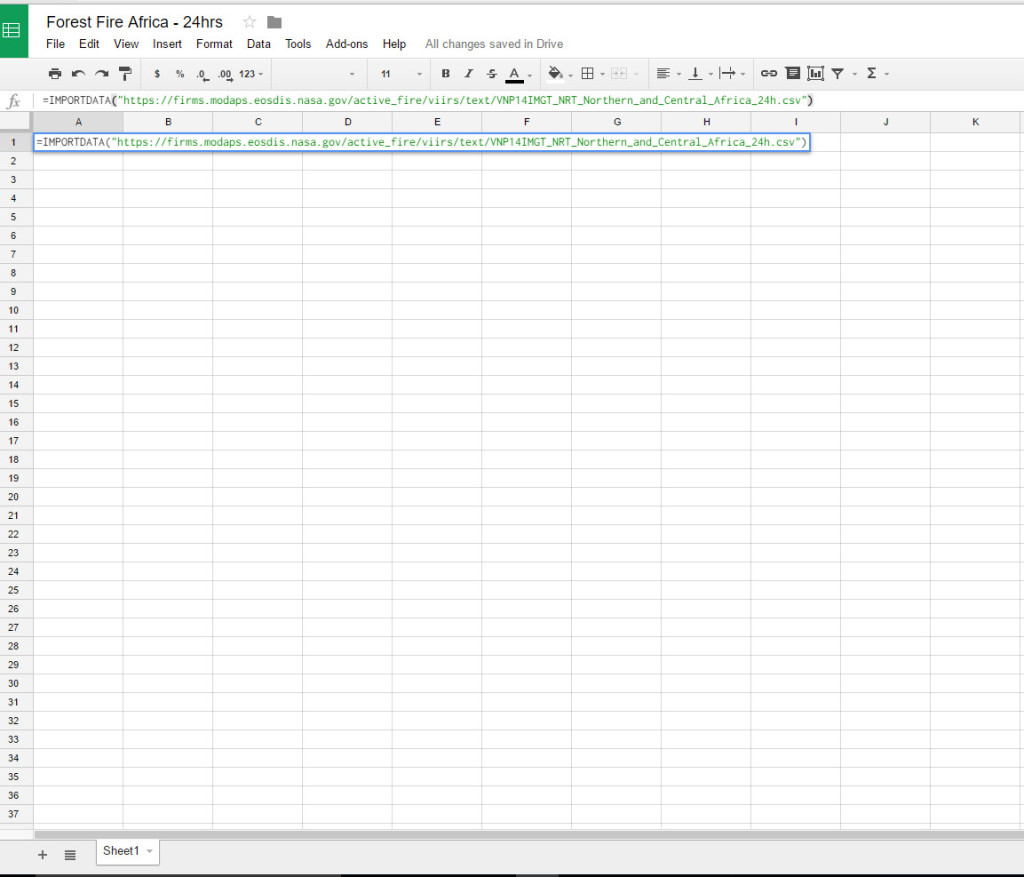
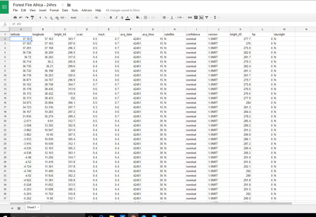
Once selected, the file can be saved as a CSV or its link may be used to update spreadsheets in real time. The dataset that contains the fires´information can be stored in a CSV file or can be stored directly on the Google spreadsheet that allows the constant update every time it is opened.To import a link just create a new spreadsheet and enter the following formula in any cell
Opening the dataset in each mapping software
Now just open the CSV file directly in the visualization software.
Let’s start with Google My Maps
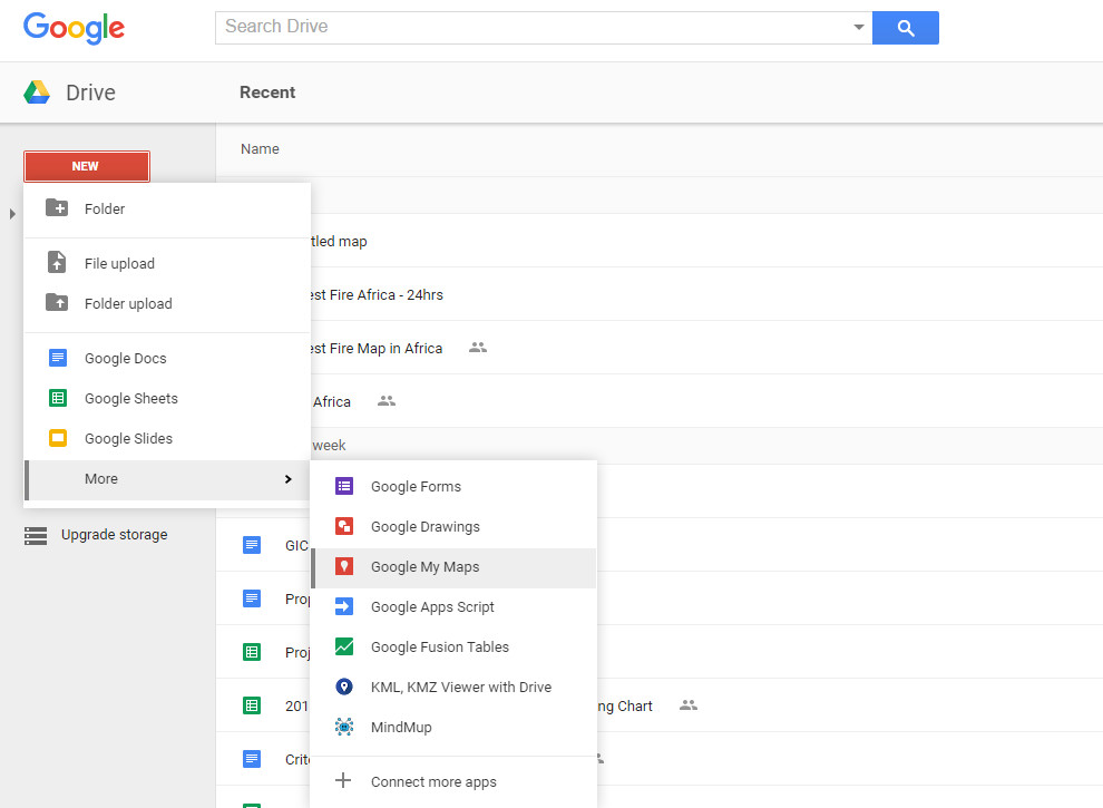
1. Choose to create a new Google My Maps on Google Drive menu
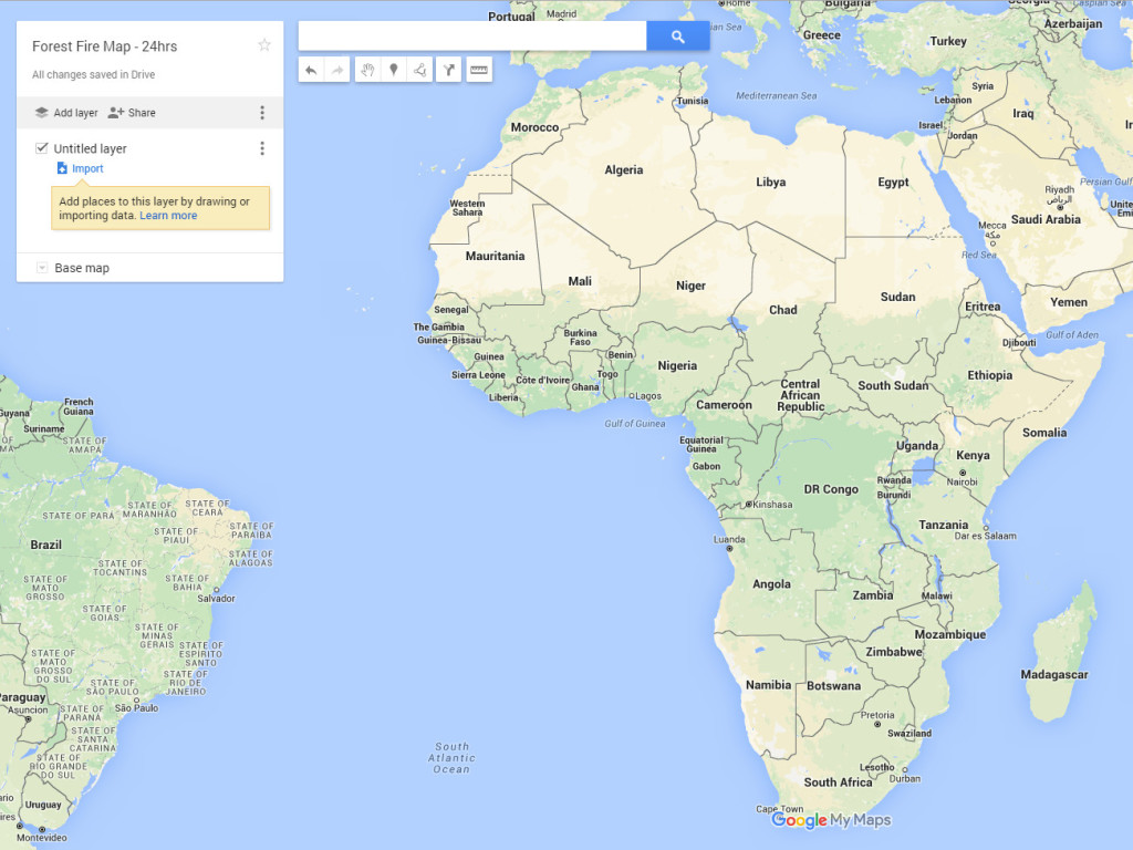
2. Click Add New Layer ‘and’ Import ‘
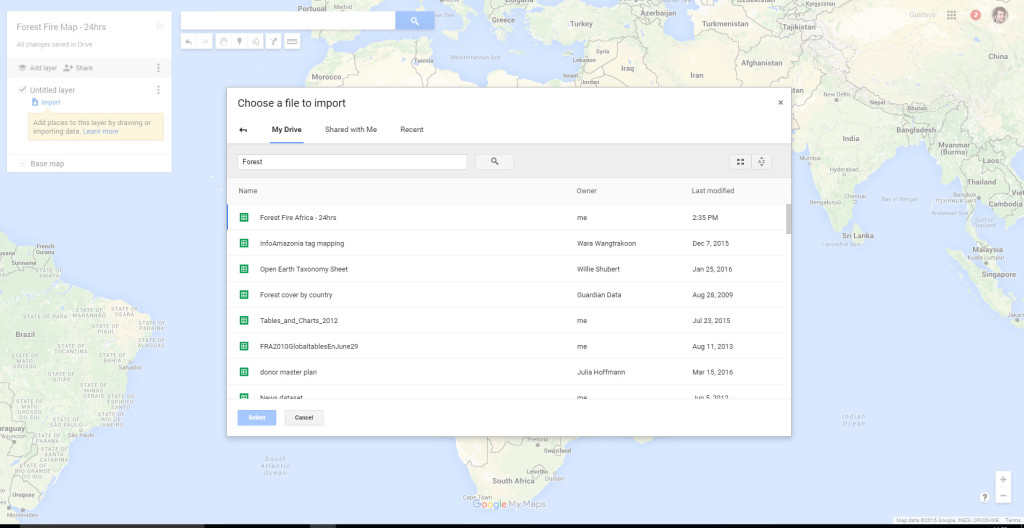
3. Use the option to attach a Google spreadsheet to your map. Alternatively, you can upload the CSV spreadsheet directly.
Now do the same in Carto.com
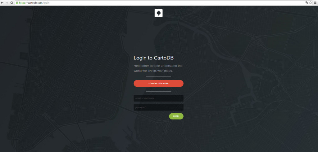
1. Connect to the Carto (a free account 250MB meets our exercise).
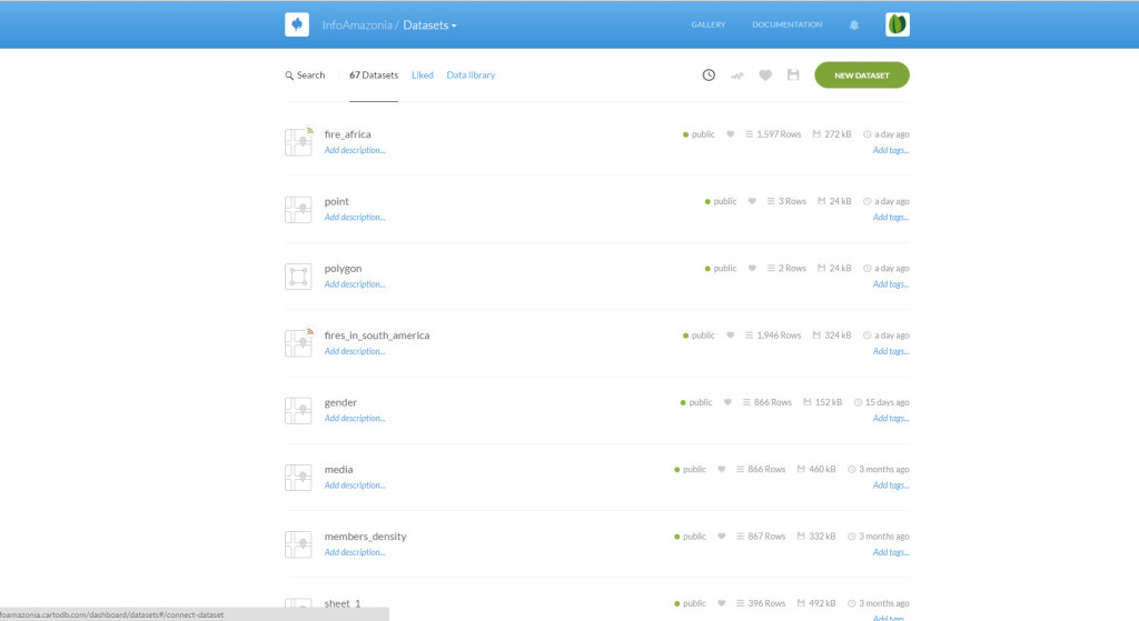
2. Select the option ‘Connect Dataset’ and load the CSV file.
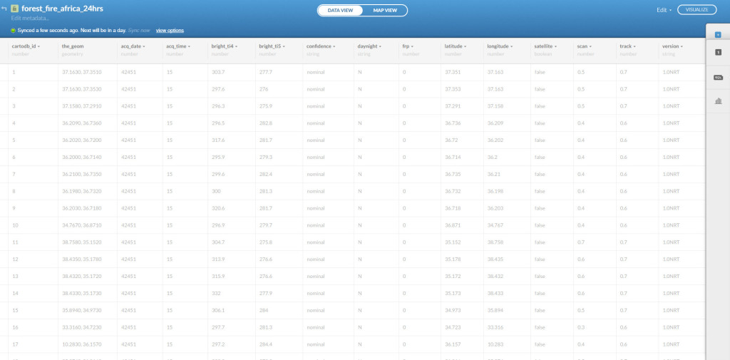
3. Another way to load data is to use the link CSV (in a paid account, you have the option of synchronizing the dataset.)
Stylizing the maps on Google My Maps and Carto.com
In both programs you can change the style and color of the icons. It can also draw simple graphical analysis, as categorization or animation data by time.
In Google My Maps do the following tests
1. Change the icon, both its shape and color or load your own icon by clicking on layer and choosing More Icons>Custom Icon
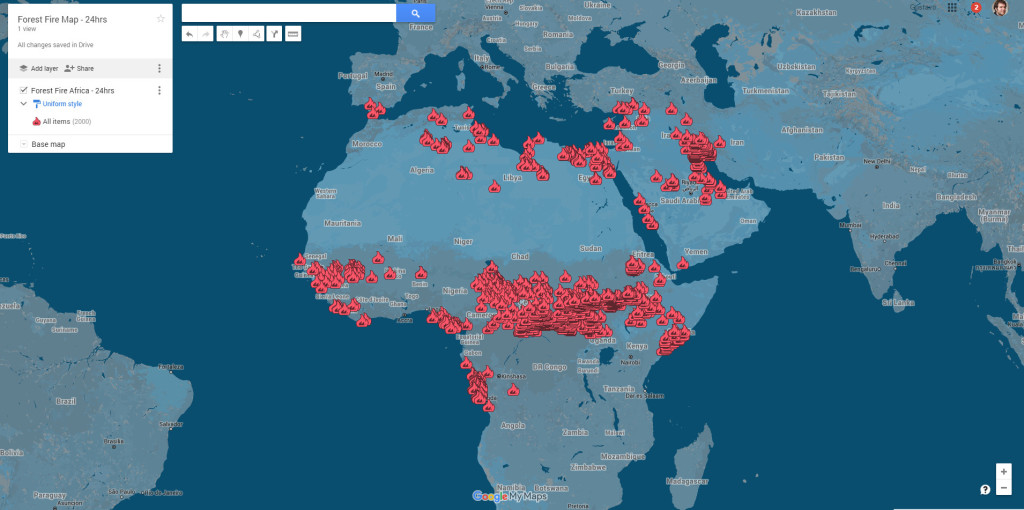
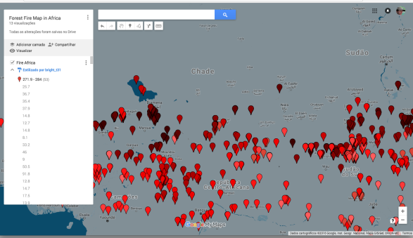
2. Sort the data tying colors to any of the parameters
In the case of Carto you can do more elaborate analysis. Make the following tests
1. Divide into categories as done also in Google My Maps
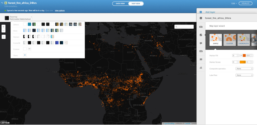
2. Make a map of animated points per time like this one done for South America. For this you need to activate the Torque tool
Share and use maps in their reports
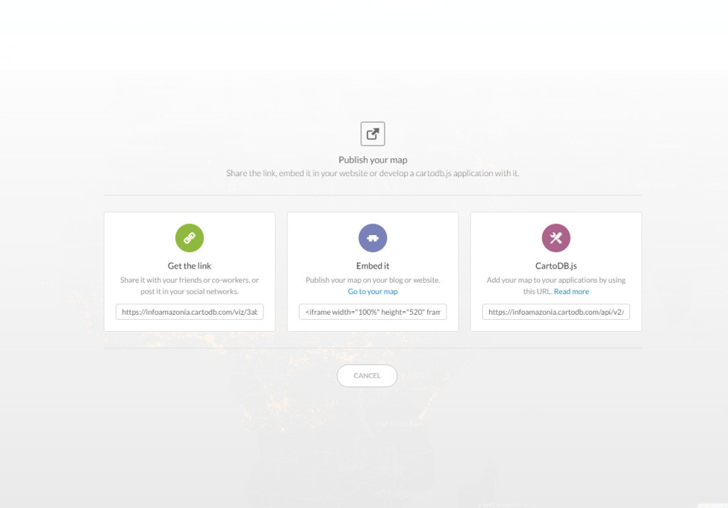
Now, just share publish and share the map.
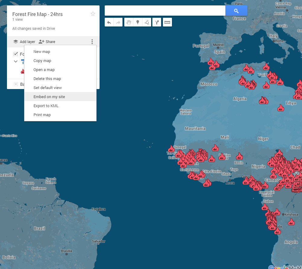
1. Both in Google My Maps with the Carto you have the option of sharing the link or the embed HTML Code.
